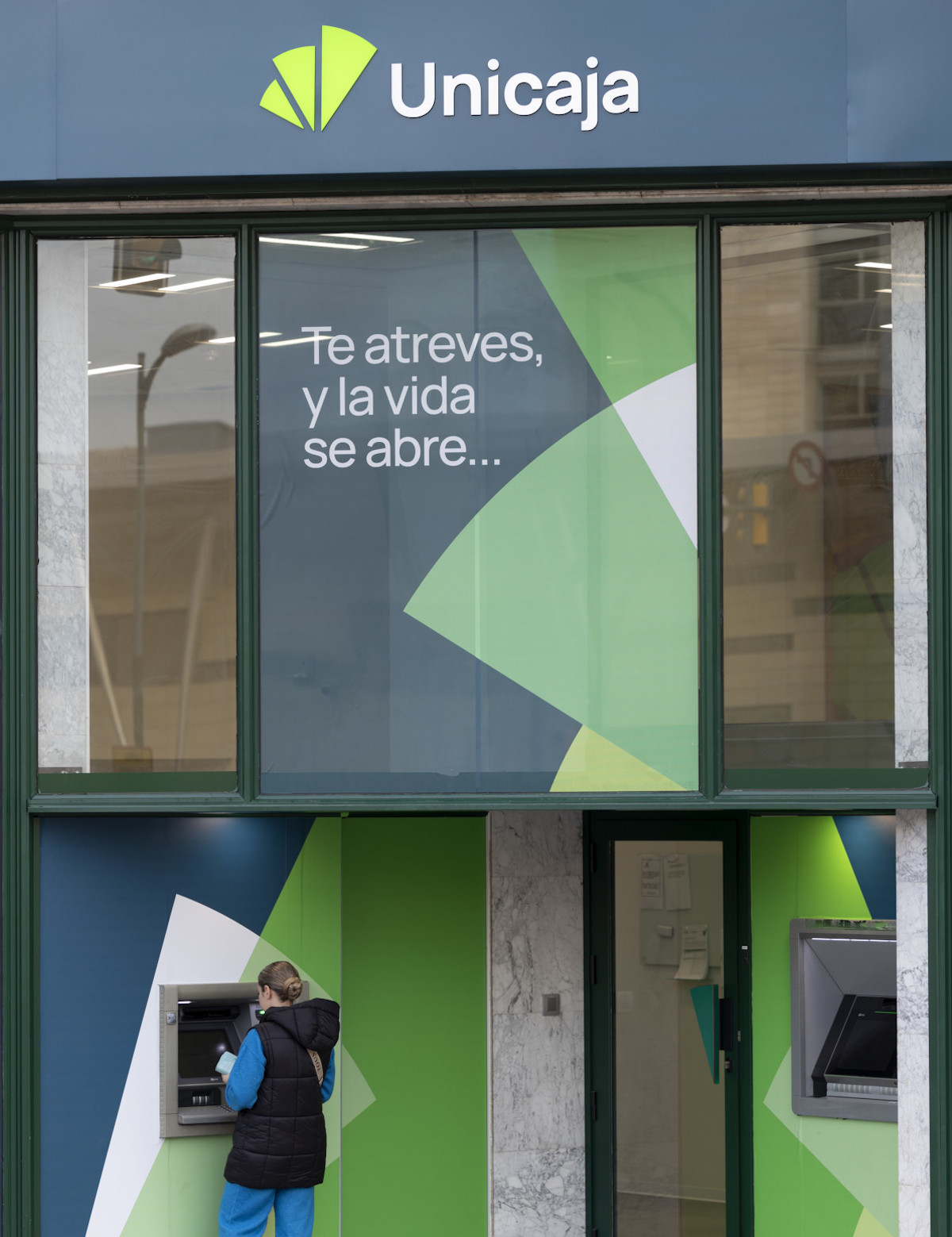
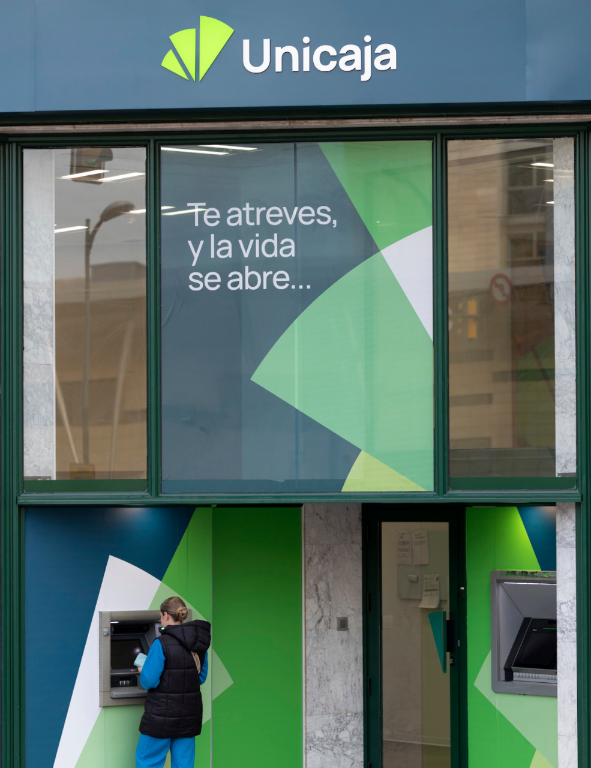
Unicaja unveils today a new Corporate Identity as a result of a deep analysis and repositioning of its brand, carried out in the context of cultural transformation and modernization of the entity. This renovation is aligned with the new corporate identity of Fundación Unicaja.
The evolution reflects the bank’s adaptation to the needs of today's society, but without losing its traditional values, with a focus on proximity to customers (current and future) and their regions of origin.
The result is a fresher image, better adapted to digital channels. The denominative element is simplified, changing from Unicaja Banco to Unicaja, and the symbol, which adopts a more intense shade of green, evolves towards a simpler and more modern concept. Thus, it reduces its segments to three, reflecting dynamism, openness and progress. In addition, blue is incorporated into the Corporate Identity.
This evolution aims to reinforce Unicaja's positioning as a sound entity open to society, as well as close, unique and differential in the Spanish financial sector, as a brand that wants to be a protagonist. The renovation process is framed and aligned with the objectives of the current Strategic Plan and underlines the differentiating aspects of the entity. These include its experience of growing step by step, with prudence, but with a determined attitude; its firm belief in the ability to progress; its capacity to integrate diversity and believe in the power of union; and its strong roots in the firm's regions of origin, with a human team capable of offering close, professional and trustworthy support, which translates into an optimal experience for its clients.
Reflection a new stage and a common project
Isidro Rubiales, CEO of Unicaja, emphasizes that this change of Corporate Identity "is the reflection of a new stage and of the common project that we want to convey to society. It is the result of a work of renovation, consolidation and boost of Unicaja's integral cultural transformation and helps to reflect where we have come from and where we are going".
"This transformation sets us apart because, while maintaining our essence, we have managed to uncover the entity's potential. We have united what makes us unique, our experience and capacity to grow, with what each of our clients is looking for: to progress while feeling accompanied in a simple way, thanks to a close relationship and a product and service tailored to their needs," he said.
Highlights of the new brand
The new Unicaja brand communicates openness, growth, dynamism and unfolding possibilities: more attractive, more contemporary and digital. It makes it capable of competing in any segment, with solvency to face challenges and accessible to its different audiences from the proximity, which is one of the great differentiating attributes of Unicaja.
Without renouncing the essence of the traditional fan, the new logo is simplified, going from nine segments to three, with a more modern image of optimism and freshness.
Green continues as the main color, characteristic of the entity since its origins, but its tone has been updated and modernized to adapt to the digital space. Blue is also incorporated to the new color palette of the Corporate Identity.
In terms of typography, the typeface used in the Visual Identity has been reduced to one. Specifically, the same font used so far in the digital channels has been kept in order to unify the typographic identities for all audiences.
This renovation of the Unicaja brand will be progressively extended to all visual identification elements, both physical and virtual, of Grupo Unicaja companies.


